
sЯushti
portfolio
welcome on board.
this portfolio is a reflection of who I am.
click on any image to magnify and hover on it to know more about it.
mY LoVe FOr PhoToGraPHy...


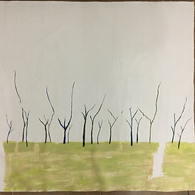
SketCHes AnD OBseRVatIonal dRAWings...


2D dESIgn prOJects…

design for saree border
design inspired from kalamkari sarees made in india.
materials used: tracing paper, poster paints, paint sketchpens

MONOCHROME COMPOSITION OF FIFA
attempt to inculcate fifa into one frame using just one colour- cerulean blue. the football is left white with patches of blue to draw attention. audience, players, goal post, scoreboard and much more are seen.
BOOK COVER FOR 'TRAVEL'
The topic explains the choice of colours. The word 'travel' brings out different emotions and therefore the use of different colours - red, blue, green and yellow.
materials used: watercolour, colour pencil

INVITATION FOR A BAKERY OPENING
colours used bring out the sense of sweetness. attempt to give the same feeling as one enters a bakery.
materials used: watercolors, poster paints

OTher WOrkS...
installation of typography wall


installation of canvases on one of my schools walls. on the occasion of 'dot day' in our school, multiple canvases were given to art students including me and were asked to illustrate a word and give emphasis on the dot in the word using typography. further, typography was done by me, on the wall to enhance the effect.
tolerance

winning painting of an interschool painting and doodling competition held in abu dhabi ,themed 'tolerance'. the warm colour used, depicts the anger and the frustration. the black vertical strokes on the top left corner depict the hands reaching out for help (covered in coal). there is broken and uneven heartbeat at the center of the page to depict how tolerance affects the core. a time bound region is seen at the top right corner.
IPHONE COVERS ON PAPER

these can be replaced from time to time inside a transparent case.
handmade portable scrabble pieces


pieces made out of cardboard (10 cm by 10 cm), then covered with masking tape and paper and finally painted with black and white poster paint. pieces stuck on the wall with the help of blu-tack .
visual harvesting at school

visual harvesting is captured drawings of a particular occasion or meeting which boosts interaction. similarly, (a group of 4 students including me) were asked to visually harvest a info pack held in school. we were asked to inculcate the gist of the meeting, emotions, sounds and visuals.
hope

abstract representation of hope(on canvas). the black circle on the left represents the circle of life. the horizontal line originating from inside the circle and moving to the bright side on the right(happiness) represents the hope that keeps you going. the gold spots represent the footsteps to a better life.
logo design
(with process)


logo of kids toy shop named 'wooden- be it lovely'. the six pictures below show to process of ideating, that is how I got to the logo's design. the ocher used is to show that the store makes wooden toys. the different colours depict toys and plays a role of attracting kids to the store.
Create Your Own Font

original font called "ethan's pause".every vertical line is a double line. every horizontal line is a dotted line. every diagonal line has a small line cutting it. lastly, every curved line has a smaller line alongside.
cOmmissioned work...
(with progress)
1. canvas washed with gesso and basic ground painting done.

3. primary structures painted.

5. finishing

2. basic paint applied.

4. addition of detail.

6. application of varnish and framing
time taken for entire process: 4 months.
inspiration from artist:
holly van hart.

medium : acrylics.
materials: brushes, paint knife and fingers.
7. sold for 800 aed.
extras...
click on image to magnify and hover on it to know about it.


this entire page contains only one font colour and style which hints towards my love for minimalism and the colour black.
THANK YOU!
fin


